The main ideas for this project were originally a film noir. However it was pointed out to us, that this would be excessively hard for our group. So, it was decided to have a modern film noir movie. Due to the tension of the script and short movie, we used a lot of short shots.
We researched online film noir clips, and lighting techniques. I redrew Najhet’s (Director) storyboards. This helped me visualise my camera shots and angles.
Personally, I have no real previous experience with filming. So this project was a learning curve for me. However I feel I have developed this skill sufficiently and I’m quite proud of our final product.
The locations I found were not all relevant for our filming. However, it was the alleyway scene that changed the most. The alleyway i found was too close to housings and was far too narrow for any side shots. We relocated to an alleyway further away, which effectively was better than the original, in lighting, location, appearance and spacing.
I have learnt how to control the iris in a camera. I have learnt how to contribute to a group.
I would either: stick to the script, and not change it, or completely rewrite the script, based on the 'unknown information' that the character Colin found. Changing the script for our own devices created a few problems and loose ends.
I would like to do more filming for other people. I find it enjoyable. Perhaps some short films or one shot videos.

Showing posts with label DP2. Show all posts
Showing posts with label DP2. Show all posts
Thursday, 26 May 2011

My VE evaluation
Monster Cave from Diana Jones on Vimeo.
My main idea for the Scary Ride was Monsters. It was based on children’s books. Not many children’s books have ghosts in them, but many have monsters. Basing my development on the target market of children, I designed the characters to be mildly scary. I wanted the children to be scared as this is a scary ride.
My brain storming revolved around what children are scared of: the dark, being alone etc. I used these in the creation and design of my ride, cart and lighting (or lack of). I was in Waterstones one day, looking in the children’s picture book section. Many books had unusual monsters and animals, but only one book had ghosts in it. Maybe this is because they’re not as scary anymore.
Story boards were created to help the visualisation of the 3D creation. It has helped significantly with the positioning of my characters.
A risk I took was creating the bones for my characters to help them move. I did not fully understand how to use these at all, so I had to learn from random tutorials on the internet. The creation of the bone structure is the easiest part. But the hardest parts were linking them to the skin, and making sure the skin moves correctly. I understand that the envelopes can help this; I have not found the correct procedure for this yet.
One problem was Applying textures to the Waverly theatre, as it was made form a spline, it had complications. To fix this i hid the theatre and created my own walls to fit. I prefer this decision as
the walls are straighter; they don’t have dips and hollows. Most of those were getting in my way.
Another problem was the skin of my characters, creasing and bending in the wrong places. I’ve tried to solve this using the envelopes and have succeeded on a few of the characters. However, some of the characters will not be able to move due to these extreme deformities.
My last problem was the multi-sub layering. I really couldn’t get it to work, so my characters are staying one colour. My main problem was the polygon IDing. I kept applying it wrong.
I have learnt much more about lighting, in this project. I’ve learnt their differences and how to change and manipulate them. There is so much you can do with them. E.g. Flickering lights, Fog and projecting bitmaps within them.
If given another chance at this project, I would create a better bone structure for my characters. Try to understand the bone and skin more, so that I could use it successfully.
I would manage my time more effectively. I would make my characters in the first two weeks, instead of the third and forth, creating more time for my experimental skin and bones. I would’ve aimed to have the rendering started and finished in the fifth week.
My IM Evaluation
My main intentions for this project were to create a working portfolio that reflects my personality. I wanted, my portfolio to be an extension of myself.
For the portfolio, i created a mood board to develop my ideas. Unfortunately the only part to transfer itself was the colour purple. I chose between two templates for the wire frame of the website. One would've been easier for me, but i didn't choose it. Instead i wanted a vertical navigational bar. To make this work, i had to float the boxes in different places. I did it quite well by myself, and Giselle remedied it for me.
Some problems i found were: floating the footer, padding the content image and reorganising the gallery. Solving the problem with the footer was simple, as Giselle helped me. How ever i do feel that i would have worked at it until it worked. For the content, i wanted a background picture, of scribbles, with overlying writing. However, i wanted the writing to be padded more than the picture. I unfortunately found out that the padding in the content affects both simultaneously. To counteract this i centred the writing so i wouldn't touch the edges of the picture. I know know, that creating a separate div tag, to put the writing in, would've worked just as well. And last of all i found creating the gallery hard, as i wasn't there for the ooriginal lesson. But the main problem was afetr saving and adding the gallery, i didn't know how to access it again to add and change some of the images. I did try to access it many times, but to no avail. I left the gallery with only a few images, which is unfortunate.
I have learnt much more about Dreamweaver in this term than i had before. I've learnt how to create divs, classes. I learnt how to change each one's settings appropriately.
If i was to re-do this project, i know i would make more pages for my animations, and a completely different gallery. I like the programme Adobe Bridge, but i don't like the layouts for the galleries. I would lighten the colourscheme, as i find it a bit too dark/pressing. Also, i would change my profile picture; it's terrible.
For the portfolio, i created a mood board to develop my ideas. Unfortunately the only part to transfer itself was the colour purple. I chose between two templates for the wire frame of the website. One would've been easier for me, but i didn't choose it. Instead i wanted a vertical navigational bar. To make this work, i had to float the boxes in different places. I did it quite well by myself, and Giselle remedied it for me.
Some problems i found were: floating the footer, padding the content image and reorganising the gallery. Solving the problem with the footer was simple, as Giselle helped me. How ever i do feel that i would have worked at it until it worked. For the content, i wanted a background picture, of scribbles, with overlying writing. However, i wanted the writing to be padded more than the picture. I unfortunately found out that the padding in the content affects both simultaneously. To counteract this i centred the writing so i wouldn't touch the edges of the picture. I know know, that creating a separate div tag, to put the writing in, would've worked just as well. And last of all i found creating the gallery hard, as i wasn't there for the ooriginal lesson. But the main problem was afetr saving and adding the gallery, i didn't know how to access it again to add and change some of the images. I did try to access it many times, but to no avail. I left the gallery with only a few images, which is unfortunate.
I have learnt much more about Dreamweaver in this term than i had before. I've learnt how to create divs, classes. I learnt how to change each one's settings appropriately.
If i was to re-do this project, i know i would make more pages for my animations, and a completely different gallery. I like the programme Adobe Bridge, but i don't like the layouts for the galleries. I would lighten the colourscheme, as i find it a bit too dark/pressing. Also, i would change my profile picture; it's terrible.
Thursday, 12 May 2011


Saturday, 7 May 2011
i've been working on my website...
not a lot, but a decent amount. Here's what I've done:
 I scribbled my layout, just how i wanted it! Now it's all purple and messy (quite like me). Things seem to be going to plan. As well as the layout, i also scribbled some creatures. They're awfully nice.
I decided my fifth page will simply be a link to my blog. I've been having some problems with my images on dream weaver, but i am working through it.
After having created my gallery page, i realised i didn't actually have a collection of work to show. So i hunted through all my dp1 work, and found some old stuff of mine.
That's all for now :)

I decided my fifth page will simply be a link to my blog. I've been having some problems with my images on dream weaver, but i am working through it.
After having created my gallery page, i realised i didn't actually have a collection of work to show. So i hunted through all my dp1 work, and found some old stuff of mine.
That's all for now :)
Wednesday, 20 April 2011
Vertical navigational bar
I just made my self a vertical navigational bar, just by pressing buttons. Wooo, go me. I hope it doesn't fall apart if i haven't done it right though.
 Here it is. I should probably change the colour scheme soon.
I learnt what i did wrong with my horizontal navigational panel. It is now fixed. i also added in the navigational links. It's looking much better, and more like my wire frame.

Now i have to add in all my images/colour.

I learnt what i did wrong with my horizontal navigational panel. It is now fixed. i also added in the navigational links. It's looking much better, and more like my wire frame.

Now i have to add in all my images/colour.
Tuesday, 19 April 2011

Monday, 18 April 2011
My visual essay so far...
Just some pics for now:


 Turbosmooth, or not to turbosmooth?


 Not the actual colouring for any of this. That is to be decided later. :)


Thursday, 14 April 2011
designing my wireframe
Yesterday, i was playing around with my website. So far it looks like this:

It's not all that good, and says complete nonsense. The colour scheme is warm, but probably not what i'll stick with. The image in the header was tiled. It's a fox, by the way.
Today we were designing the wireframe for our websites. I have desined two. I'm not sure which one i'll pick yet. But they are both kept fairly simple, just to stop me going insane.
I'm leaning towards the second design, even though having the navigational panel down the side will be a little harder. It will be fun trying to make this. Until i get angry and walk away from the computer.

It's not all that good, and says complete nonsense. The colour scheme is warm, but probably not what i'll stick with. The image in the header was tiled. It's a fox, by the way.
Today we were designing the wireframe for our websites. I have desined two. I'm not sure which one i'll pick yet. But they are both kept fairly simple, just to stop me going insane.
 |
| design 1 |
 |
| design 2 |
Tuesday, 12 April 2011

Thursday, 7 April 2011


more of this...
I finished my shark monsters yesterday. I may have to change their texture, as they're actually quite hard to see in the mist.
Or maybe i could just change the colour of the mist. I'd rather not change the density.
I am animating my snake today.
I'm hoping he won't look too bent out of shape. This would be because I'm manipulating the polygons to create movement, and he only has eight height segments. I may need to give him a higher polygon count in height to make his bending look more fluid. Fingers crossed.
 |
| Sharks in the depths of the mist |
I am animating my snake today.
I'm hoping he won't look too bent out of shape. This would be because I'm manipulating the polygons to create movement, and he only has eight height segments. I may need to give him a higher polygon count in height to make his bending look more fluid. Fingers crossed.
Tuesday, 5 April 2011
animating things about
So, I'm in my holidays. It's nice and stuff.
So yeah, I've been attempting to catch up with my animation. It's going good but i think I'm going crazy. Every time i look back onto the file, the cart (which i previously animated) has decided to become stationary again. Maybe I'm dreaming this. Maybe I'm not saving it properly. Maybe the cart just doesn't want to go round the track.
I don't know.
I might save it to last, then render it before it reverts back again. I will conquer this cart!
Here's some visual updates:
So yeah, I've been attempting to catch up with my animation. It's going good but i think I'm going crazy. Every time i look back onto the file, the cart (which i previously animated) has decided to become stationary again. Maybe I'm dreaming this. Maybe I'm not saving it properly. Maybe the cart just doesn't want to go round the track.
I don't know.
I might save it to last, then render it before it reverts back again. I will conquer this cart!
Here's some visual updates:
 |
| A ghostly figure waiting for the cart |
 |
| Just hanging about |
 |
| One shark in - One shark out |
Friday, 11 March 2011
Week 4
We've successfully filmed three locations, but we've still got some to do.Unfortunately, not a long time to film it in.
The Location today was a bit problematic at times, as the office building was fairly small and fairly cluttered. However we prevailed. And only one minor shot was missed.
We'll get it done next week hopefully.
The Location today was a bit problematic at times, as the office building was fairly small and fairly cluttered. However we prevailed. And only one minor shot was missed.
We'll get it done next week hopefully.
Week 2 & 3
Week Two
I haven't done much this week.
So last week Najhet (Director) drew up the storyboard. Tweaks were made to it today, and it has now been passed to me. I'm gonna redraw it, all nice and pretty. I'm doing this for two reasons:
1) We need a neater version with more annotations
2) It will help me, as the camera dude, to visualise the shots that I'll be taking.
Week Three
I've drawn up most of the storyboard now. Turns out Najhet left the last page at home.
We practiced lighting in 106b. Which interestingly is the room we booked for the photography scene. Overall what we learnt from this practice was to use as little lighting as possible, and to close the iris of the camera whilst shooting. This creates the moody, dark feeling we need for our film noir style.
Also, i went back to the alley way to analyse it's abilities/worth. It is actually quite narrow, so any side shoots would be out of the question. Lighting is limited to the midway lamp post. I believe any shots, will have to be taken from the bottom of the stairs. All other locations are fine.
I haven't done much this week.
So last week Najhet (Director) drew up the storyboard. Tweaks were made to it today, and it has now been passed to me. I'm gonna redraw it, all nice and pretty. I'm doing this for two reasons:
1) We need a neater version with more annotations
2) It will help me, as the camera dude, to visualise the shots that I'll be taking.
Week Three
I've drawn up most of the storyboard now. Turns out Najhet left the last page at home.
We practiced lighting in 106b. Which interestingly is the room we booked for the photography scene. Overall what we learnt from this practice was to use as little lighting as possible, and to close the iris of the camera whilst shooting. This creates the moody, dark feeling we need for our film noir style.
Also, i went back to the alley way to analyse it's abilities/worth. It is actually quite narrow, so any side shoots would be out of the question. Lighting is limited to the midway lamp post. I believe any shots, will have to be taken from the bottom of the stairs. All other locations are fine.
Wednesday, 23 February 2011
Week 1
Our script is Shift.
About a poor paranoid secret seller that gets hunted down.
My first job, allocated by Jordon, is to find suitable locations in Nottingham for our filming. So, not knowing Nottingham very well, i just started walking. As you may guess, after an hour and a half i was quite lost. But that's not important, what's important are these potential locations.
The last location was where i finally gave up on walking. I liked the continuity of the lampposts. Also they look a bit old fashioned. I found a few old lamp posts, but most were near schools. And that could cause problems.

About a poor paranoid secret seller that gets hunted down.
My first job, allocated by Jordon, is to find suitable locations in Nottingham for our filming. So, not knowing Nottingham very well, i just started walking. As you may guess, after an hour and a half i was quite lost. But that's not important, what's important are these potential locations.
 |
| The Arboretum Tunnel |
OR
 |
| A Back Alley |
 |
| Revolving Doors in Newton |
 |
| ECU of Lockers, Waverly |
 |
| PostBox, Post Office |

Tuesday, 15 February 2011
Texturing and all that jazz
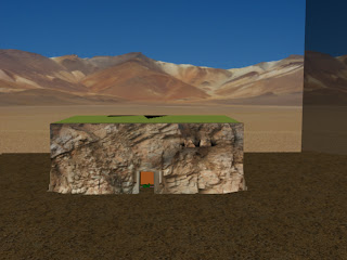
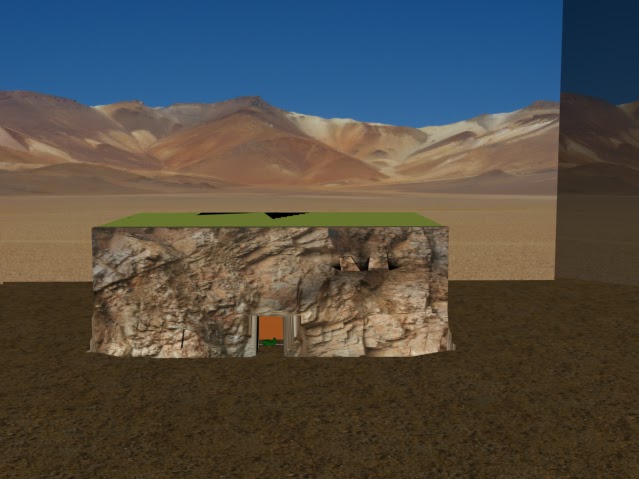
So far i have added an entrance onto my building. It's all rocky-like. It's similar to my design, with one difference. In my design i had a cave on top of the entrance, but i left that out in the creation. It would've looked good though.

And tthen, i got round to animating the cart. No problems there, it went quite smoothly.


Recently, i added all my textures in the scene. It makes it look much better.


I applied a snake skin texture to my monster cart. Took me a while to get it looking good though.But it's all good now.
-me again-

And tthen, i got round to animating the cart. No problems there, it went quite smoothly.


Recently, i added all my textures in the scene. It makes it look much better.
 |
| View without waverly walls |
 |
| close up of floor map |

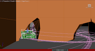
As the Waverly walls were being annoying (it wouldn't let me apply a texture) i made my own. Which are much more co-opperative. They look good.

I applied a snake skin texture to my monster cart. Took me a while to get it looking good though.But it's all good now.
-me again-
Sunday, 13 February 2011
I'm dithering...
I'm not sure how to texture my characters. I've been advised to colour them all fun colours like bright red, pink and blue. I know that they're for kids and all that, but they're supposed to be scary, not gay.
I understand that I'm designing it for kids, but i don't want them sitting in my ride thinking "oh, what pretty colours", i want them crying and peeing their pants. It's a scary ride. I don't go easy on kids.
Maybe there is a compromise somewhere. i just need to figure out multi-object colouring again. Can't remember how to do it.
I understand that I'm designing it for kids, but i don't want them sitting in my ride thinking "oh, what pretty colours", i want them crying and peeing their pants. It's a scary ride. I don't go easy on kids.
Maybe there is a compromise somewhere. i just need to figure out multi-object colouring again. Can't remember how to do it.
Thursday, 10 February 2011
Snowflakes!
I just found these awesome websites!

You can make snowflakes! It's so simple, yet so awesome!
Here's mine, it's inverted so you can see it.

Also found this website:
which let me make this evergreen tree


and this thing. It's awesome! Woo
i made another monster
So i tried getting in uni today, but it was surprisingly busy. So i mooched home to do work instead, and i did this:


 He was originally going to have white eyes, but i made them red because it looks freaky. Which in effect is scary. I only failed on the mouth, it wasn't supposed to be round. But that's just how turbosmooth rolls when you're not paying attention to it. I also had to make the teeth longer to compensate for the round mouth.
But anyways, he's looking good, so that's what matters.
-me-


But anyways, he's looking good, so that's what matters.
-me-
Subscribe to:
Posts (Atom)